CSS and CARP Design
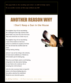
We have been working on a project in Dreamwaver. We are given a messed up web page that is in need of a new design. Once we were given our page we began using codes to design and make this page look better. The HTML is very difficult to do, but with the CSS it is easier to use. The style is different because the codes are different on each one so thats why both of the pages look different.
Contrast: contrast is mostly color. We used the colors in the dog for the text and for good contrast we used different shades of brown. This helps the text all go together without anything clashing and looking misfit.
Alignment: alignment is the way the text lines up. Before the text was out of line and all over the page but using codes we got the text to line up. This helps the page look clean and easy to read.
Repetition: repetition is how your design goes together, a constant font or color can be repetition. The whole web page has similar colors, like the colors from the dogs, and the fonts are consistent.
Proximity: proximity is "grouping" this is a poem and all the paragraphs are grouped together so it looks clean. The beginning paragraph is italicized to group it from the other paragraphs.
I learned that CSS can be hard to use but it is easier to use for coding and designing a website. It is used to design and make websites or pages look better. This project I have learned how to design and make a website page to look better!


Comments
Post a Comment