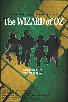
Wizard of Oz Project Contrast: The different fonts on the poster The outline on the graphic The color of the background to the white font Black and white contrast "The" and "of" are smaller because they are less important Alignment: In the bottom left corner all of the credits are lined up perfectly The O in Olathe is lined up with the beginning of the graphic The T is lined up with the credits The date and time are centered justified Repetition: The colors black and white are used in all of the fonts and graphics The font in "The Wizard of Oz" is also used in the date, time, and price All of the credits are the same font Proximity: The spacing in "The Wizard of Oz" is different because "The" and "of" are less important "Olathe Northwe...