Posts

Showing posts from January, 2018
Image
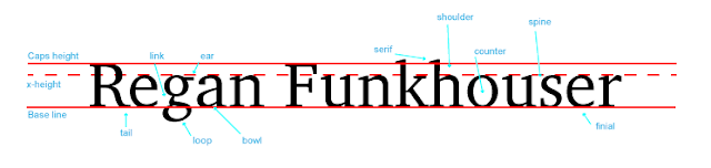
                                                               My Font Project                       What is this project about?                This project teaches you about the technical side of fonts and the   different types of ways to identify the fonts. We identified 10 different parts of the fonts including, link, ear, serif, shoulder, counter, spine, finial, bowl, loop, and tail. I didn't know that there are so many parts to fonts and very precise ways of picking a font. Fonts are important because they make people and things feel different ways.                                                   What did I learn?                            I have learned how to choose fonts that are right for               companies, food restaurants, and many more things. In the future I want to be a             Graphic Designer and I have so far learned so much in this class. I have helped design things            for my aunts company but never really knew w
Image
  My Color Wheel Project  What was the project? This is my first graphic design project! This project was a lot of fun. we got to learn new techniques and how to do different things in Adobe Illustrator.  This project represents the colors on The Color Wheel and what colors go well together for designs.                    What did I learn?                   In this project I learned about different colors and                   how they work together and how some don't work                   together. I never knew that colors have so much                   science behind it. Graphic Design is teaching                   me how to use colors in your design that make                   people feel different ways so they enjoy their                   product. The skills I used from this project I                   will use in my whole Graphic Design career.                                                                                      How did I do?        
Image
Logo Color Schemes          Analogous                                        This logo uses the analogous colors of orange, red, and yellow. I think the company probably chose these colors because it is a food company and these colors are often used for food. This logo uses the analogous colors of orange, red, and yellow. I think the company probably chose these colors because it is a food company and these colors are often used for food.     Complementary   This logo uses complementary colors of blue and orange. I think the company probably chose these colors because they complement each other very well and it makes the fox stand out. This logo uses the complementary colors of yellow and purple. I think the company probably chose these colors because the colors compliment each other very well and they look good together.  Warm This logo uses the warm colors of yellow and red. I think the company chose these colors because the co