Posts

Image
My Snowflake
Image
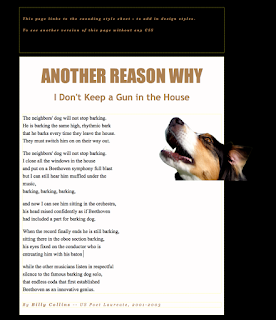
                                                      CSS and CARP Design               We have been working on a project in Dreamwaver. We are given a messed up web page that is in need of a new design. Once we were given our page we began using codes to design and make this page look better. The HTML is very difficult to do, but with the CSS it is easier to use. The style is different because the codes are different on each one so thats why both of the pages look different.  C ontrast: contrast is mostly color. We used the colors in the dog for the text and for good contrast we used different shades of brown. This helps the text all go together without anything clashing and looking misfit. A lignment: alignment is the way the text lines up. Before the text wa...
Image
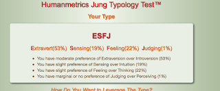
Regan's Personality Type Today I took the Myers-Briggs Type test. I scored ESFJ! E means "extrovert" I like being around people and thats where I find my energy and It makes me the most happy.  S means "sensing" this means I have a preference of sensing over intuition.  F means "feeling" I have a slight preference of feeling over thinking, I base my decisions off of feeling rather than thinking.  J is "judging" this is only a 1% but I make a judgment better than perceiving. I share this personality with quite a few celebrities. I share it with Sally Struthers,Elvis Stojko, and William McKinley.   I feel like this test is very accurate. I love working with people and I find value in their opinion. I can get things done better if I'm working with other people to get it done. I am organized and get things done on time. I am very caring towards pe...
Image
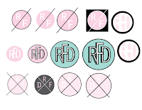
                                        My Logo This week we have been working on our logo project in E9. This was my first time ever making a logo and it was very educating and fun! We started out the project by sketching up ideas, anything that I thought of I drew on my paper. After picking my top 3 logos, I narrowed it down to one logo. Once we got into Adobe Illustrator we began to make shapes and letters. I decided to use the circle shape, and a nice blue color to make the logo feel fun.                                                       Once I chose my color and shape I began to play around with my fonts and strokes. The letters were the most difficult part of the project because they are hard to get just right. I had a hard time picki...
Image
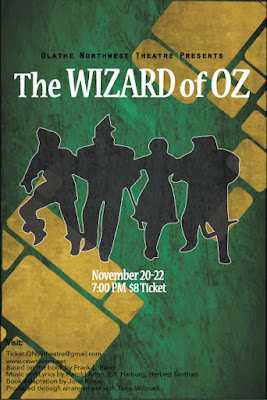
                                Wizard of Oz Project  Contrast:  The different fonts on the poster The outline on the graphic The color of the background to the white font  Black and white contrast "The" and "of" are smaller because they are less important    Alignment: In the bottom left corner all of the credits are lined up perfectly  The O in Olathe is lined up with the beginning of the graphic  The T is lined up with the credits  The date and time are centered justified  Repetition: The colors black and white are used in all of the fonts and graphics The font in "The Wizard of Oz" is also used in the date, time, and price All of the credits are the same font  Proximity: The spacing in "The Wizard of Oz" is different because "The" and "of" are less important  "Olathe Northwe...
Image
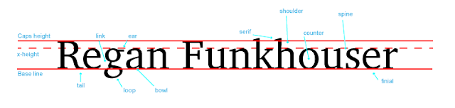
                                                               My Font Project                       What is this project about?                This project teaches you about the technical side of fonts and the   different types of ways to identify the fonts. We identified 10 different parts of the fonts including, link, ear, serif, shoulder, counter, spine, finial, bowl, loop, and tail. I didn't know that there are so many parts to fonts and very precise ways of picking a font. Fonts are important because they make people and things feel different ways.                                            ...
Image
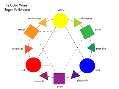
  My Color Wheel Project  What was the project? This is my first graphic design project! This project was a lot of fun. we got to learn new techniques and how to do different things in Adobe Illustrator.  This project represents the colors on The Color Wheel and what colors go well together for designs.                    What did I learn?                   In this project I learned about different colors and                   how they work together and how some don't work                   together. I never knew that colors have so much                   science behind it. Graphic Design is teaching                   me how to use colors in your design that make     ...